Understanding Code Visually: Three Ways that Work
 In trying to help developers understand code we have made sure to listen to what they have to say. We’ve noticed that many developers utilize UML style diagrams to try to understand code. However many problems exist with existing tools. I have tried using a number of UML tools and found that the reverse-engineering capabilities in the majority of them were not helpful for understanding tasks. They focus on designing tasks; reverse-engineering capabilities often just end up showing convoluted pictures and lots of useless information. Even developers that commonly use these tools ask us how to best understand code. Of course there are many solutions to this problem and the solution varies depending on the situation.
It is important to think about which specific perspectives you need to understand. Is the structure of the codebase in a state of disrepair and needs attention? Or are underlying code concepts, features, and logic the most important? There seem to be three main types of diagrams people use to help visually understand code.
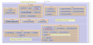
The Mile High View: A layered architectural diagram can be really helpful to know how the main concepts in a project are related to one another. They provide a good starting point when other resources are unavailable. Examining the relationships between packages in a project can provide a good sense of where the most important code lies. They can also give insight into projects and packages that are poorly named or organized in a counterintuitive way.

A layered diagram showing how the different components of Apache Log4J are related. You can clearly see that the components varia, chainsaw,and jmx build on top of the core interfaces and logger class along with support utils
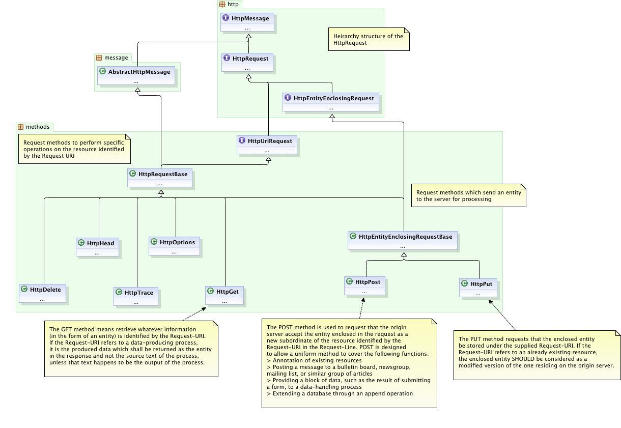
The Core: It is important to try to figure out how the code works with regards to the main concepts. Class diagrams are exceptionally useful here. Pen-and-paper works often enough, but tools can not only speed up the process but also help you save and share such diagrams. Inheritance relationships as well as class structure can become immediately apparent with a well constructed class diagram. By limiting the scope of your diagram to a specific concept you can easily avoid the problem of overwhelming, “everything but the kitchen sink” style diagrams.

A Class diagram showing the heirarchy model of Apache HttpClient. Specifically, the Http Methods package showing all the HttpRequest Classes. Notice that the POST and PUT requests inherit from HttpEntityEnclosingRequestBase where as GET and others do not.
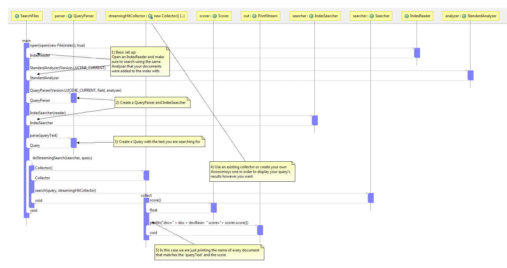
Key Use Cases: By tracing at least one key use case for your app you can gain a great deal of insight. You likely can get the most important use cases from anyone on your team, and stepping through them will be really helpful. Most IDE’s provide helpful solutions for quickly navigating the source. This can often be helpful for simple logic but more complex scenarios may require sequence diagrams. Some sequence diagramming tools allow you to focus on the most important aspects of the logic you are interested in. Complex sequences of method calls, conditionals, and loops can often be reduced to an elegant diagram that will illuminate any potential bugs or unintended consequences of your code.

A sequence diagram describing the procedure for searching a Lucene 3.0 index. Notice that the collect method is inside an anonymous inner class (Collector) and is responsible for actually outputting the results of the search.
When originally confronted with the problem of understanding code visually I was left unsatisfied by the array of tools currently available. Many showed too much information or were difficult to use and were therefore unhelpful for understanding code. Some say that code is inherently unable to be visualized in a useful way. We at Architexa are intent on challenging this belief. We have attempted to address the problems inherent in understanding a complex codebase by creating an easy to use dynamic visualization tool. Let us know your thoughts.
I am writing new articles once every 2-3 months. Interested in getting notified? Sign up here.